Summary:
This book has primarily been focused on interaction design. In these first few chapters several topics have been discussed related to this general theme including the encroachment of computers into all other devices, the struggle with interacting with computers, the value of interaction design on a company/market scale, the typical design problems in software and the development of software, the importance of interaction design to the success of a product, the influence of software engineers and their misguided mindset of design, and the psychology of the common computer programmer.
The author has used several analogies to illustrate his ideas, a very common one being his 'dancing bear' analogy. This 'dancing bear' illustrates a user's tolerance of bad quality design with the satisfaction of a software's primary purpose, ie the crappy dancing of the bear and the fact that a bear is able to dance all together. Another analogy that shares the title with this book is 'the inmates are running the asylum'. This is in reference to the fact that interaction design is generally left up to the software developers, and because of the influence of their decisions they are often left in charge of the outcome of a product albeit their lack of understanding the importance of design through every level of development.
In some of the latest chapters the author has included more and more excerpts from colleagues and friends who have had first hand experience with the need to invest in the importance of interaction design. Several of these cases were about a possible product that although was 'capable' and 'viable', lacked the 'desirable' trait that users value immensely. In these examples the companies that did not implement a strong sense of design either saw their product fall short of every being released or saw their product fall to the way side in the market by disloyal customers who switched to the competition's product.
Discussion:
So far this reading hasn't been too bad. It really follows in suit with the first book we read. I guess considering this class is based on interaction then that is most likely the content of all the books we will be reading. On a template scale though, this book is really similar to the prior; discussing interaction, the focus on the user, including several analogies and examples to illustrate their points, etc. I wonder if this book will conclude with how to incorporate good interaction design into software development, because so far it has only been highlighting the issues surrounding it. One last note that I want to add is that I think we should have read this book in its entirety instead of splitting it up. It took me about four hours to read these first seven chapters and if we have to wait three weeks to read the rest I'm going to have a hard time remembering all of this. Not to mention we are breaking it up with another book to read in between this one, which I foresee causing me to lose my grasp on the ideals of this book. Oh and another I particularly liked was his discussion about Microsoft, Apple, and Novell; there pros and cons as a business and the resulting status of where they are now because of their experiences.
Sunday, February 14, 2010

Thursday, February 11, 2010
Learning from IKEA Hacking: “Iʼm Not One to Decoupage a Tabletop and Call It a Day.”
By Daniela Rosner and Jonathan Bean
Comment:
Lupfer, Nicholas
Summary:
This paper discussed IKEA Hackers and the role the internet plays in their lives. IKEA Hackers are people who take the relatively cheap mass marketed IKEA furniture and customize it for personal use or for creative purposes. The authors of this paper interviewed several IKEA Hackers to understand what they do, why they do it, and how the internet and particular forums and webistes play a role. IKEA Hackers themselves are typically Do-It-Yourself (DIY) persons. They like to manipulate the already existing products to fit their wants. Not only does this give a more personal feel to the furniture they modify, but the act of hacking itself gives them an artistic and creative feel.
The larger part of this paper discussed how the internet influences IKEA Hackers. Although IKEA Hacking is generally a personal experience, a lot of the hackers like to post their ideas online for others to appreciate and learn from. Likewise these online resources serve for good ideas and starting points for other IKEA hackers to pick up the hobby. A couple of common websites used by IKEA Hackers are IKEAHacker.com and Instructables.com. Below is a picture of a typical IKEA Hacker's workspace:

Figure 2. A common site for IKEA hacking: a residential kitchen. IKEA cabinets are “hacked” through modifications or the addition of custom components. One participant blogged his kitchen remodeling project.
Discussion:
The main reason I read this paper is because IKEA Hacking was mentioned in my assigned reading. In the previous paper I read IKEA Hacking was mentioned as an example of sustainable interaction design in that the IKEA furniture was often used and modified for reuse by the user who inherently reflected the principles of an 'everyday designer' mentioned in the paper. This paper however was far less interesting than the first, and although it was short (preferable length), it relatively had very little content except for introducing the concept of an IKEA Hacker. IKEA Hacking is an interesting idea but an entire paper devoted to it with emphasis on how online resources are used felt unnecessary.
Comment:
Lupfer, Nicholas
Summary:
This paper discussed IKEA Hackers and the role the internet plays in their lives. IKEA Hackers are people who take the relatively cheap mass marketed IKEA furniture and customize it for personal use or for creative purposes. The authors of this paper interviewed several IKEA Hackers to understand what they do, why they do it, and how the internet and particular forums and webistes play a role. IKEA Hackers themselves are typically Do-It-Yourself (DIY) persons. They like to manipulate the already existing products to fit their wants. Not only does this give a more personal feel to the furniture they modify, but the act of hacking itself gives them an artistic and creative feel.
The larger part of this paper discussed how the internet influences IKEA Hackers. Although IKEA Hacking is generally a personal experience, a lot of the hackers like to post their ideas online for others to appreciate and learn from. Likewise these online resources serve for good ideas and starting points for other IKEA hackers to pick up the hobby. A couple of common websites used by IKEA Hackers are IKEAHacker.com and Instructables.com. Below is a picture of a typical IKEA Hacker's workspace:

Figure 2. A common site for IKEA hacking: a residential kitchen. IKEA cabinets are “hacked” through modifications or the addition of custom components. One participant blogged his kitchen remodeling project.
Discussion:
The main reason I read this paper is because IKEA Hacking was mentioned in my assigned reading. In the previous paper I read IKEA Hacking was mentioned as an example of sustainable interaction design in that the IKEA furniture was often used and modified for reuse by the user who inherently reflected the principles of an 'everyday designer' mentioned in the paper. This paper however was far less interesting than the first, and although it was short (preferable length), it relatively had very little content except for introducing the concept of an IKEA Hacker. IKEA Hacking is an interesting idea but an entire paper devoted to it with emphasis on how online resources are used felt unnecessary.
Wednesday, February 10, 2010
A Sustainable Identity: The Creativity of an Everyday Designer
By Ron Wakkary and Karen Tanenbaum
Summary:
This paper brought to the surface the inadequacies of interaction design in that they are consumer based, and not designed for sustainability. This paper goes into research to study how the end-user is an 'everyday designer' in that they adapt products to fit their required needs (design-in-use), and that several of these sustainable principles could be implemented for interaction design. The target of this paper was an ethnography study involving three families in which the authors studied how these families would redesign and reuse items in their household to fit their changing needs.
A lot of the study for this paper was based off of Blevis’s principles for SID (Sustainable Interaction Design) which in short are: disposal, salvage, recycling, remanufacturing for reuse, reuse as is, achieving longevity of use, sharing for maximal use, achieving heirloom status, finding wholesome alternatives to use, and active repair of misuse. There were three specific examples included in this paper that were accompanied with their possible implementations into interaction design.
The first example in this paper was a planner book, which showed the SID principles of promoting renewal and reuse, as well as linking invention and disposal. One of the participants, Lori, had a planner in which instead of using the template layout and calendar features of the original design, instead adapted it to fit her needs by using it to take notes and make lists with the additional use of sticky notes which when used could easily be discarded. The possible implications of this that could be used for interaction design are:

Figure 1 Lori shows how a sticky note allows reuse of a page of her planner.
The third example given in this paper was a recipe book which was originally a journal of the participants mother, which now was not only a recipe book but was also used to store very important information like Christmas lists. This example illustrates the principle of promoting quality and equality. Its possible interaction design implications are:

Figure 2 Kerry's recipe book was originally her mother's
journal and has been in use for over a decade.
The third example presented in this paper was a family calendar placed on the refrigerator. The hopes of this calendar was that the whole family would use it and that it would be an easy way for them to see everyone's schedule. However, in some cases this was not practical. Although this worked well for the mother who was involved in most of all the families activities, the father was reluctant to put his running schedule on the calendar since it really only affected him. In another case the daughter chose not to put some of her schedule on the calendar since she preferred to keep it private. The sustainable interaction design illustrated by this example was sharing for maximal use, but in several contexts this conflicted with de-coupling ownership and identity as seen by the withholding of some information from the calendar. The possible implications of this example are:

Figure 3 Timmie placing a sticker on the family calendar.
The results of the ethnography done by the authors lead to the formation of design-in-use principles that work alongside Blevis's sustainable interaction design principles. However it is important to note that the authors believe that rather than focus on the material properties of the design as does Blevis, that instead the focus should be on the use of the object and its reuse/adaptability.
The design-in-use principles developed in this paper are:
Discussion:
This paper brought an interesting and abstract idea to interaction design in that products should be modeled with sustainability in mind. I think this is an ever growing importance in today's world; that people are more and more focused on conservation. This makes me think of some of the electronic devices that I have. When they go bad, what happens to them? You can't really adapt them to work for other scenarios and fixing them can be timely and costly, so most of them just get thrown out. The bad thing about this is that in most cases that was the way they were designed, for use and then discard. I think the shift mentioned in this paper that the user should instead be viewed as an everyday designer rather than a consumer can really have an impact on how things should be designed and the type of products that we could potentially get from this.
Summary:
This paper brought to the surface the inadequacies of interaction design in that they are consumer based, and not designed for sustainability. This paper goes into research to study how the end-user is an 'everyday designer' in that they adapt products to fit their required needs (design-in-use), and that several of these sustainable principles could be implemented for interaction design. The target of this paper was an ethnography study involving three families in which the authors studied how these families would redesign and reuse items in their household to fit their changing needs.
A lot of the study for this paper was based off of Blevis’s principles for SID (Sustainable Interaction Design) which in short are: disposal, salvage, recycling, remanufacturing for reuse, reuse as is, achieving longevity of use, sharing for maximal use, achieving heirloom status, finding wholesome alternatives to use, and active repair of misuse. There were three specific examples included in this paper that were accompanied with their possible implementations into interaction design.
The first example in this paper was a planner book, which showed the SID principles of promoting renewal and reuse, as well as linking invention and disposal. One of the participants, Lori, had a planner in which instead of using the template layout and calendar features of the original design, instead adapted it to fit her needs by using it to take notes and make lists with the additional use of sticky notes which when used could easily be discarded. The possible implications of this that could be used for interaction design are:
- Design the capacity for users to overlook the formalized design and still find the artifact usable in ways equal to or greater than the original design intentions for use.
- Incorporate materials and software qualities to allow for renewal and invention.

Figure 1 Lori shows how a sticky note allows reuse of a page of her planner.
The third example given in this paper was a recipe book which was originally a journal of the participants mother, which now was not only a recipe book but was also used to store very important information like Christmas lists. This example illustrates the principle of promoting quality and equality. Its possible interaction design implications are:
- Consider collaboration to include the broader notion of sharing, e.g. conceive of a Personal Digital Assistant (PDA) designed for maximal use by a family and therefore is easily shared;
- Consider that longevity in interactive technology is not only a result of usefulness and that we design emotional qualities into artifacts.

Figure 2 Kerry's recipe book was originally her mother's
journal and has been in use for over a decade.
The third example presented in this paper was a family calendar placed on the refrigerator. The hopes of this calendar was that the whole family would use it and that it would be an easy way for them to see everyone's schedule. However, in some cases this was not practical. Although this worked well for the mother who was involved in most of all the families activities, the father was reluctant to put his running schedule on the calendar since it really only affected him. In another case the daughter chose not to put some of her schedule on the calendar since she preferred to keep it private. The sustainable interaction design illustrated by this example was sharing for maximal use, but in several contexts this conflicted with de-coupling ownership and identity as seen by the withholding of some information from the calendar. The possible implications of this example are:
- Design for maximal sharing
- Allow for low risk ad hoc and public testing/experimentation

Figure 3 Timmie placing a sticker on the family calendar.
The results of the ethnography done by the authors lead to the formation of design-in-use principles that work alongside Blevis's sustainable interaction design principles. However it is important to note that the authors believe that rather than focus on the material properties of the design as does Blevis, that instead the focus should be on the use of the object and its reuse/adaptability.
The design-in-use principles developed in this paper are:
- Design-in-use involves a high degree of creativity that in the best sense of the word makes a user unpredictable.
- Design artifacts become resources for further creativity as an outcome of design-in-use.
- Design-in-use qualities emerge over time as do design actions.
- From consumer to creator
- From over-determined to underdetermined
- From user to designer
Discussion:
This paper brought an interesting and abstract idea to interaction design in that products should be modeled with sustainability in mind. I think this is an ever growing importance in today's world; that people are more and more focused on conservation. This makes me think of some of the electronic devices that I have. When they go bad, what happens to them? You can't really adapt them to work for other scenarios and fixing them can be timely and costly, so most of them just get thrown out. The bad thing about this is that in most cases that was the way they were designed, for use and then discard. I think the shift mentioned in this paper that the user should instead be viewed as an everyday designer rather than a consumer can really have an impact on how things should be designed and the type of products that we could potentially get from this.
Saturday, February 6, 2010
Team Analytics: Understanding Teams in the Global Workplace
By Jan H. Pieper, Julia Grace, Stephen Dill
Summary:
This paper described the web application Team Analytics and a user study done for the program. The Team Analytics application is designed to help users who work in groups to find important information about the members without having to see each one's individual profile. It is composed of several widgets that help relay information to the user that otherwise might be painstakingly hard to gather and analyze by oneself. Below is a screenshot showing the program:

Figure 1. Screenshot of the Team Analytics application showing information
about ten people.
As can be seen in the picture the program utilizes several widgets to display the information. Of these include a photo gallery at the top, an organization chart that shows the hierarchy of the people and other information such as their location or company, there is a 'timezone pain' chart that helps display optimal times for organizing meetings or conversations, the pie chart shows the distribution of people across the group so that the user can see how many belong to one department or one company, and the last widget is the 'bizcard section' which displays small information boxes for individual people which is linked to the person's full profile.
The Team Analytics program was deployed in February 2007 and has since been well received. A user study was conducted by a third party in which the original authors were invited to contribute some questions which were used to test the satisfaction and use of the program. A large number of participants reported using the application weekly and a good number even daily. The overall satisfaction of the program was around 90%. Some of the more detailed parts of the study reported on the individual widgets themselves.
The most popular widgets were the organization chart, bizcard section and email plugin followed by the picture gallery, timezone pain, and attribute pie chart. The widget that had the least satisfactory rating was the timezone pain, which came to the surprise of the authors. Based off of the comments given they reasoned that even though people found the widget very useful it was confusing. Some of the future work for this would be modifying some of the requested changes such as making the timezone pain less confusing and perhaps a better scheme than using colors as an identifying property. Another thing they are looking into is integration with Sametime, their corporate instant messaging system.
Discussion:
I liked this paper and I like that the technology discussed is not just research but is actually already out in the real world being used. I found the relative simplicity of the application but that it was overwhelmingly liked intriguing. I also greatly appreciate that the program was designed for convenience to the user and that some of the work they did on it after original deployment was to integrate it into email to make it even easier to access. I would like to think that this is something similar to what I could be working on in the future.
Summary:
This paper described the web application Team Analytics and a user study done for the program. The Team Analytics application is designed to help users who work in groups to find important information about the members without having to see each one's individual profile. It is composed of several widgets that help relay information to the user that otherwise might be painstakingly hard to gather and analyze by oneself. Below is a screenshot showing the program:

Figure 1. Screenshot of the Team Analytics application showing information
about ten people.
As can be seen in the picture the program utilizes several widgets to display the information. Of these include a photo gallery at the top, an organization chart that shows the hierarchy of the people and other information such as their location or company, there is a 'timezone pain' chart that helps display optimal times for organizing meetings or conversations, the pie chart shows the distribution of people across the group so that the user can see how many belong to one department or one company, and the last widget is the 'bizcard section' which displays small information boxes for individual people which is linked to the person's full profile.
The Team Analytics program was deployed in February 2007 and has since been well received. A user study was conducted by a third party in which the original authors were invited to contribute some questions which were used to test the satisfaction and use of the program. A large number of participants reported using the application weekly and a good number even daily. The overall satisfaction of the program was around 90%. Some of the more detailed parts of the study reported on the individual widgets themselves.
The most popular widgets were the organization chart, bizcard section and email plugin followed by the picture gallery, timezone pain, and attribute pie chart. The widget that had the least satisfactory rating was the timezone pain, which came to the surprise of the authors. Based off of the comments given they reasoned that even though people found the widget very useful it was confusing. Some of the future work for this would be modifying some of the requested changes such as making the timezone pain less confusing and perhaps a better scheme than using colors as an identifying property. Another thing they are looking into is integration with Sametime, their corporate instant messaging system.
Discussion:
I liked this paper and I like that the technology discussed is not just research but is actually already out in the real world being used. I found the relative simplicity of the application but that it was overwhelmingly liked intriguing. I also greatly appreciate that the program was designed for convenience to the user and that some of the work they did on it after original deployment was to integrate it into email to make it even easier to access. I would like to think that this is something similar to what I could be working on in the future.
An Exploration of Social Requirements for Exercise Group Formation
By Mike Wu, Abhishek Ranjan, and Khai N. Truong
Summary:
This paper discussed a need for a solution to finding exercise partners and what the characteristics that this system would need to have in order to function appropriately. It started off detailing some of the positive aspects of exercising followed by the study in which the authors conducted. Their study was done in two parts, the first being an online questionnaire in which approximately 100 participants were involved, followed by two small focus groups to reflect on the results of the questionnaire and to bring in some more specific data. The main goal of the study was to answer the following questions:
Discussion:
I am glad that a study is being done to see what kind of system is needed to help people in finding exercise partners. I think exercising is becoming increasing important especially with the health issues our nation is facing and some of the points they made about the benefits of working with a partner are well justified. I think a paper like this could easily lead to some sort of social site for finding activities and exercise partners by locality, or perhaps as like a feature/plugin on existing social sites like facebook.
Summary:
This paper discussed a need for a solution to finding exercise partners and what the characteristics that this system would need to have in order to function appropriately. It started off detailing some of the positive aspects of exercising followed by the study in which the authors conducted. Their study was done in two parts, the first being an online questionnaire in which approximately 100 participants were involved, followed by two small focus groups to reflect on the results of the questionnaire and to bring in some more specific data. The main goal of the study was to answer the following questions:
- Do people who exercise have partners? If so, how did they find them?
- If people do not have exercise partners, what are the reasons?
- What happens when people do not have an exercise partner?
- What do people look for in their ideal exercise partner?
- What information would people be willing to share to find compatible exercise partners?
"We found that for our participants, (1) collaboration among exercise partners is a two-phase process: discovery of common activities and subsequent collaboration, (2) there are temporal variations in privacy levels in opportunistic types of exercise collaboration, (3) lack of a partner can affect the perceived quality of the exercise experience, (4) skill range, location, and schedule similarity are key criteria for compatible partners, and (5) there is a willingness to share some personal information to enable spontaneous exercise."
Discussion:
I am glad that a study is being done to see what kind of system is needed to help people in finding exercise partners. I think exercising is becoming increasing important especially with the health issues our nation is facing and some of the points they made about the benefits of working with a partner are well justified. I think a paper like this could easily lead to some sort of social site for finding activities and exercise partners by locality, or perhaps as like a feature/plugin on existing social sites like facebook.
Wednesday, February 3, 2010
(Perceived) Interactivity: Does Interactivity Increase Enjoyment and Creative Identity in Artistic Spaces?
By Amy L. Gonzales, Thomas Finley, and Stuart Paul Duncan
Summary:
This paper tested user interaction and its correlation to user satisfaction, as well as interaction promoting a self-conception of user creativity. The goal of the study was to test two research questions in an experimental context:
The results of the study proved that the users who reported that the system was interactive also reported that they enjoyed it more than those who could not interact with it. However both the interactive and non-interactive participants reported relatively similar results in that they didn't feel more creative after experiencing the system. Some of the possible reasons that the authors gave to explain this were that the art system did not offer a wide enough range of influence to truly let the user feel creative, another being that users were never prompted to try to be creative while experiencing the system, or perhaps that the self-concept of creativity was secluded to just the experience with the installation, and did not carry with the user afterward, and a final suggestion 'that interactive art does not actually induce a sense of creativity as otherwise presumed'.
Discussion:
I think the study they conducted was quite good. I do agree with their conclusion that an interactive art installment is more enjoyable than a non-interactive one. Another thing I liked about this study is that they tested using musical sounds because I believe that music is a great medium for testing things such as emotional experience and creativeness. I do think that their second question was answered correctly by their user study, and that the self-concept of creativeness is confined to the actual experience with the art installation. If they did the test again except expanded on the ability of the user to impact the music I believe they would have seen better results for the first question and similar for the second unless they prompted the users to be creative.
Summary:
This paper tested user interaction and its correlation to user satisfaction, as well as interaction promoting a self-conception of user creativity. The goal of the study was to test two research questions in an experimental context:
- How does interactive art impact user satisfaction?
- How does interactive art shape the self-concept of the user as creative?
The results of the study proved that the users who reported that the system was interactive also reported that they enjoyed it more than those who could not interact with it. However both the interactive and non-interactive participants reported relatively similar results in that they didn't feel more creative after experiencing the system. Some of the possible reasons that the authors gave to explain this were that the art system did not offer a wide enough range of influence to truly let the user feel creative, another being that users were never prompted to try to be creative while experiencing the system, or perhaps that the self-concept of creativity was secluded to just the experience with the installation, and did not carry with the user afterward, and a final suggestion 'that interactive art does not actually induce a sense of creativity as otherwise presumed'.
Discussion:
I think the study they conducted was quite good. I do agree with their conclusion that an interactive art installment is more enjoyable than a non-interactive one. Another thing I liked about this study is that they tested using musical sounds because I believe that music is a great medium for testing things such as emotional experience and creativeness. I do think that their second question was answered correctly by their user study, and that the self-concept of creativeness is confined to the actual experience with the art installation. If they did the test again except expanded on the ability of the user to impact the music I believe they would have seen better results for the first question and similar for the second unless they prompted the users to be creative.
Interactivity Attributes: A New Way of Thinking and Describing Interactivity
By Youn-kyung Lim, Sang-Su Lee, Kwang-young Lee
Summary:
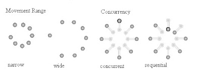
This paper described the research done by the authors involving the correlation between interactive attributes and emotional effects. The paper discussed testing different interactive methods that they believed were concrete and could be measured. The aim of their research as stated in the paper was to 'develop a set of attributes that works as a language to describe the shape of any interactivity of an interactive artifact.' The seven attributes that they believed could be described are displayed below, each with its opposing counterpart totaling to fourteen measurable attributes of interactivity.
The research done also included a user study which tested the two main questions they were looking to answer:
Discussion:
This paper was interesting in that it analyzed the emotions behind interactivity, concluding that there are concrete interactive attributes which can be used to describe the feelings felt when manipulating an interactive object and the perceived mapping that a user might use to compare the interaction to that of a material property. I liked the idea behind this paper, but I don't feel that they presented much evidence or even a very thorough principle. I believe that their conclusions were correct, but I think it really only scratched the surface of the topic and a further investigation is needed to really present a novel concept.
Summary:
This paper described the research done by the authors involving the correlation between interactive attributes and emotional effects. The paper discussed testing different interactive methods that they believed were concrete and could be measured. The aim of their research as stated in the paper was to 'develop a set of attributes that works as a language to describe the shape of any interactivity of an interactive artifact.' The seven attributes that they believed could be described are displayed below, each with its opposing counterpart totaling to fourteen measurable attributes of interactivity.
- Concurrency (concurrent-sequential)
- Continuity (continuous-discrete)
- Expectedness (expected-unexpected)
- Movement range (narrow-wide)
- Movement speed (fast-slow)
- Proximity (precise-proximate)
- Response speed (delayed-prompt)

The research done also included a user study which tested the two main questions they were looking to answer:
- Are interactivity attributes perceivable as we perceive the attributes of physical materials?
- Do interactivity attributes have meaningful emotional effects as other physical materials have?
Discussion:
This paper was interesting in that it analyzed the emotions behind interactivity, concluding that there are concrete interactive attributes which can be used to describe the feelings felt when manipulating an interactive object and the perceived mapping that a user might use to compare the interaction to that of a material property. I liked the idea behind this paper, but I don't feel that they presented much evidence or even a very thorough principle. I believe that their conclusions were correct, but I think it really only scratched the surface of the topic and a further investigation is needed to really present a novel concept.
Subscribe to:
Posts (Atom)
